One of the key concepts that are vastly ignored is that websites are technical tools with a business goal. So it’s a technological product that exists solely to effectively attract visitors and convert them quickly and easily into clients.
But website owners are wowed with tons of funky animations, sliding effects, image transitions, and whatnot, and web developers who only look at making an eye-candy website are too happy to oblige. The end result is a technically complex website, with too many moving parts, too many elements that can go wrong at any time.
Then, what was supposed to be a technical tool with a business goal is turned into a technical product where its own existence is the goal itself. This is very bad news for website owners that got sold on the shiny metal object psychology.
Here’s a quick review of a site owned by a fitness celebrity who aims at getting other celebrities to book private training sessions in order to lose a few more percents of body fat and get better muscle toning. I am focusing here on the shortcomings of the site and pointing out ways it can get better. So I will not sugar coat anything. Honest reviews are just that: plain, honest, in-your-face reviews where the goal is to help you fix the site, not to stroke your ego. Now, let’s get started.
(Note: This blog post started off as an unacceptably long response to a Site Review Request on a marketing related Facebook group. After passing the 700-word mark I realized that it’s unacceptable to post it as a comment. And that’s why you’re now seeing it as a blog post. The website is obviously owned by a fitness celebrity, and I’m sure that the trainer would benefit from reading this free review especially since I offer site reviews as a premium service. Such reviews are much, much, much more in-depth and with “How To Fix” sections though, which I didn’t write here as it takes a lot more time to formulate solutions for such a high-ticket audience of this celebrity trainer – who will remain anonymous in this post for a specific reason)
The Homepage: What It Says, And What It Ought To Say, And How Clear A Communicator It Really Is?

A Homepage is there as a personal guide through the website. When the average Joe comes to the website, he probably has a dozen or so other opened tabs with Gmail, Facebook, eBay etc. So as a visitor, my concentration is not fully devoted to the website, and my browser’s resources are also not fully devoted to this one site.
At best, when on a Homepage, I’d spend a few seconds to glance at it to find all the reasons why I’m NOT supposed to waste my time with the site because I have 10 other tabs to go through.
So I, Joe Average, only take 3-5 seconds to find a reason to leave the site. If I find reasons to leave faster than I find reasons to stay, I’m out. If for some reason I can’t scroll through the homepage, or some images don’t load because of some fancy animation effects, or whatever, I am definitely out.
This site uses a ton of JavaScripts that are complicating the technical layout of the site, and for some reason when I tried to scroll through the homepage, it wouldn’t move. The scrolling works on any other tab except on this one, so as an average user I’m reviewing the homepage only based on what it actually available to me.
(Note: I actually thought this IS everything the homepage has. Only after refreshing it at the end of writing this text I realized that there are other things on the page that I wanted to see. This is the problem with funky transitions based on JavaScripts, they tend to break for no apparent reasons and kill off conversion)
This homepage says too little. From what I see on the page, there’s a video, some download links, and a register/signup form. But I have no idea what the page is about, who the guy is, and why would I bother downloading PDFs. I don’t want to download PDFs, I have tons of them from a few years back and I will never review them. They just create clutter on my Desktop. Actually, I have a few folders named Desktop Downloads, Downloads 1, Downloads 2, New Folder, New Folder (1) etc… all full of digital junk I’ve downloaded over the years and hoping to review them “sometime”.
As a first-time visitor on the homepage, there’s too much left unsaid so I have trouble staying on the page. If the pitch is to get fitness clients I’d spend some time fine-tuning the Ideal User Persona and then address his/her biggest pain points:
- Is it bodybuilding as the favicon suggests?
- Is it a weight-loss related program?
- Is it for toning and cardio as the image and posture of the guy on the video?
 The Logo has a confusing message. The font style of the name is somewhat military-style so it does convey rugged workout or intense workout.. something you’d see in military training. That’s OK, that’s good. But the “tagline” ruins it for me with all the mixed messages with listing degrees and the author/model/speaker/etc. It’s not setting the brand properly. Looking at it doesn’t give me confidence that this guy has a clear focus of what he has to offer, and what I have to gain from him.
The title/tagline of the page could use a more rugged, bolder, a font that would create an emotional response. The one used seems to lack punch. Talking about fitness and getting in shape really awakens pro-sport allusions and being Joe Average I want to see the same punch. I see how sports headlines are formatted on TV, magazines etc. and if my brain doesn’t see similar formatting and messaging I won’t make the connection. I just won’t.
I’m Joe Average. Don’t make me think, just tell it plain, simple, loud. “Get in the best shape of your life” can mean that:
- I, a 300lbs Joe Average can step the game up and can now walk through 2 miles instead of barely crawling through a mile.
- Or it can mean that I, Joe Average, a professional athlete, can shave off a second from his 100m sprint, or
- I, Joe Average your baby boomer badass with an artificial knee, can now actually walk without a crutch.
Framing, giving context to the tagline of the homepage is extremely important, and unfortunately, there’s much to be done in fine-tuning this tagline. A text without a context has no meaning. No meaning – no message. No message, no conversion.
A Homepage should quickly tell me where I am, what can I do here, and why should I bother at all instead of closing the tab and heading on to the next site. So far the homepage, with heavy stuttering and hesitation, told me that some famous degree-loaded guy does something to help people step up their game. But I don’t know what sort of game we’re talking about, I don’t know if this thing really works for me, the most important person in the world, AND, I don’t know why I should bother looking for more answers from a site that has trouble communicating clearly. I’d probably just close the tab and move on.
From a design perspective, the page lacks vibrancy. The dominant black color can be very nicely accompanied by stark white, red, green shades to add both class and power to the design. As-is, the design looks as if it “just happened” and as if it is not a product of careful thinking, branding and deliberate graphical communication.
The About Page: Do’s, Dont’s, When And How?
So I’m on a site for a fitness something. I head to the About page and expect to see the trainer, and see what HE has to say to ME about what I get from his program. I want HIM to talk to ME. Plainly, clearly, to the point.

The About page kills interest with the guy in the suit. The last thing I want to see as a person being interested in fitness is a trainer in a suit. The text lost my interest at “co-host of national syndicated….” This opening is more suited for teaching/consulting pitch, not for a fitness program. Also, if it’s fitness, I want the Trainer to address Me. The third-person singular approach is too impersonal for such a personal issue as fitness.
Being Joe Average I just don’t even bother reading the text. People buy from people. The About section… it better be a person talking to a person. Going to the About page is my attempt to form a connection with this trainer. But with such a detached, depersonalized text I have nothing to connect with.
The paragraphs seem longish without any highlighted words so I can scan through and get the main gist of the text. When looking for a trainer, I want to see that this guy can deliver results, and I don’t mean published articles in journals. I’m not looking for a scientist. I’m looking for a person who knows fitness and can successfully guide me along. Some big words won’t convince me.
On the contrary, it can make me feel odd or make the trainer look unserious, as is the case with the “he was metrically recognized…” you mean metrically as in centimeters vs inches, or what? Being recognized as a fitness influencer on Twitter doesn’t really mean a whole lot. I can’t relate to Twitter or to Onalytica. They are websites. I’m a person.
I would be perfectly fine with such mentions in a separate section labeled Public Recognitions or alike, but that would only be AFTER the initial personal connection section of the About page. As this is a personal brand built around the trainer himself, a more suitable start would be to cover some key moments of the trainer’s life that turned him into the fitness celebrity that he is. Once I get that personal connection it’s completely acceptable to hear all the public recognition this trainer has.
It’s an About page. It’s got to cover the basics of a personal introduction and quickly transition into an elevator-pitch like: “Hello, I’m XXX. I’m in fitness since XXX because I struggled with XYZ and then did ABC and got to be the man I am today. I’d love to help you with your ABC so you can reach your fitness goals”
The Media Section: An Image Says 1000 Words, But Show It Too Late And Only Stones Will Hear
Building websites for personal trainers of any sort are all about the personality of the trainer and their success story. Texts help convey the message but images and videos… they’re gold in communicating personability and value. I’m so glad to see that there is a solid amount of images, videos, ads etc from this trainer presence on various media, from print to TV.

This trainer has some excellent pics in the Photos section that would dramatically change the character of the site if some of them are placed on the Home and About pages. MUCH more punch on a fitness pitch if I see a pic of a guy who’s got literally no belly fat. THAT’s what I’d want to see on a homepage! Tell it quick, tell it powerfully.
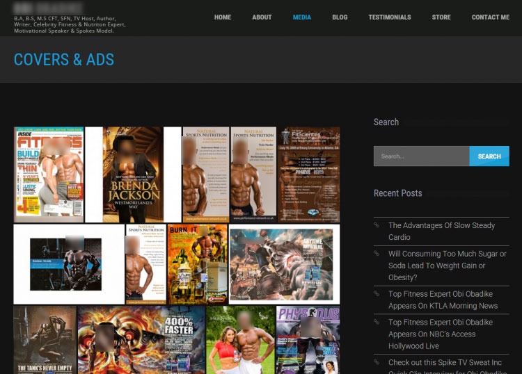
As-is, the Media section seems created without a single message that it wants to convey. This is especially visible in the Covers and Ads section. This page looks a lot more like a portfolio for a male model than for a fitness trainer.
I’m much more interested to see that this trainer is featured in Inside Fitness. Him being featured on some printed flyers doesn’t really add value as a successful personal fitness trainer. There are so many other magazine covers that would communicate a lot more value than these ads.
The Other Pages: Elements Without A Sequence
The Testimonials section rocks! Here for the first time on the site I, Joe Average, can see that this is obviously a weight-loss related site for folks that already are in somewhat OK shape and want to take their physique to the next level. But this is a bit too late, these Before/After photos should be right on the homepage. At least a few of them. Nothing speaks as before/after photos for fitness.
(Note: There IS a Testimonials section on the homepage that I couldn’t see because the site wouldn’t respond to scrolling thanks to heavy usage of JavaScripts perhaps. But if the visitor cannot see that there is something below the signup form, and a simple scrolling doesn’t work, they most likely will assume that there is nothing else on the page for them to look at.)

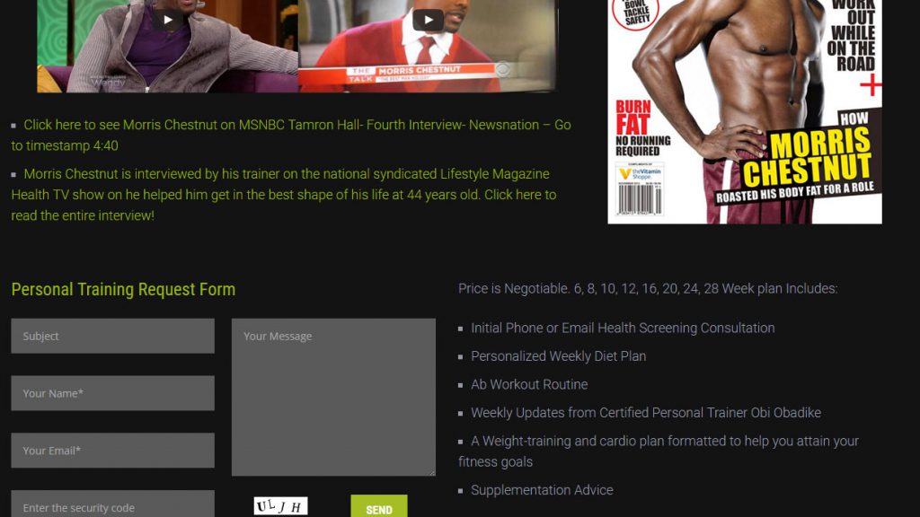
The Store section isn’t really a store section. It’s the Testimonials page with an extra block of text and a lead capture form. I’d make this page into a better landing page for people who want Personal training sessions. Btw this “personal” should be more prominent on the homepage too. This trainer is obviously a brand name with all the press around him, so the goal for his site would be to generate personal training gigs with people whose appearance is more important than for the average Joe (yours truly included) and more importantly, to speak to people who can afford a personal training deal with this trainer.

The Contact Me page starts off well with the personal page label. I like that it’s not “Contact” but “contact ME”. But then it blows it with the generic “Enter your information” and buries it with the SUBMIT QUERY button. I’d never use “SUBMIT” on a CTA. People will react on this with “FU, I will NOT submit”, especially people who need and can invest in a celebrity personal trainer. For those type of folks, the world is the one that submits, not them. And the pic… if it’s about a Contact Me request, I’d put a lot more personable image that conveys accessibility, openness, reliability. The one used speaks “hey, look at me, I’m ripped, fast, agile, I’ll eat you for breakfast”
Summary
Websites, as technical tools with business goals, have to be built in such a way that technology amplifies the clear business message. Here, as in just about 90% of the websites out there, the lack of planning is being masked with funky animations thanks to heavy use of JavaScript. This heavy use of JavaScripts caused the site to be unresponsive to scrolling when opened in a Chrome browser with a dozen other opened tabs. So instead of technology being a catalyst, it ended up impeding the site’s ability to communicate value.
The text, images, ordering of pages and wording on the email capture forms can use some tweaking that can massively improve the business effectiveness of the site.
Don’t get me wrong. This is an OK site. But for a niche market as this trainer’s, “OK site” is a grave enemy of “excellent site”. People with 10% body fat who think they still have some pounds to shed aren’t settling for an OK physique. They want perfection. They know it when they see it. The trainer seems to be right on the edge of perfection… but his site has obviously fallen on the site of chubbiness and needs to get back in shape in order to deliver.
What do you think of this review? Was it helpful, inspirational, informative? If you would like to get your site reviewed please get in touch using the Contact page.


