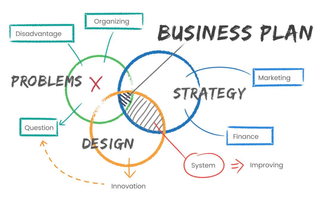
Landing Page Optimization is part of the launch of every product or service marketers offer to their audience. Nowadays you need a laser-focused approach on the Internet in order to speak the right words and pass on the right message to your ideal audience so that they do the action you want them to do. Without Landing Page Optimization procedures you risk literally ruining the campaign before it even begins.
If you try to speak to everybody… nobody will really understand you properly or bother to read what you want to say. Corporate, generic talk and political correctness in landing pages won’t work well. The faster your landing page initiates an emotion, the better your chances are to convert visitors into clients. This is why once you define your target audience you build the landing page in as precise a way as possible so that every single page element would add value and communicate the message clearly to your audience.
From Signup forms to sales pages, optimizing the design and content of your page will make or break your business.
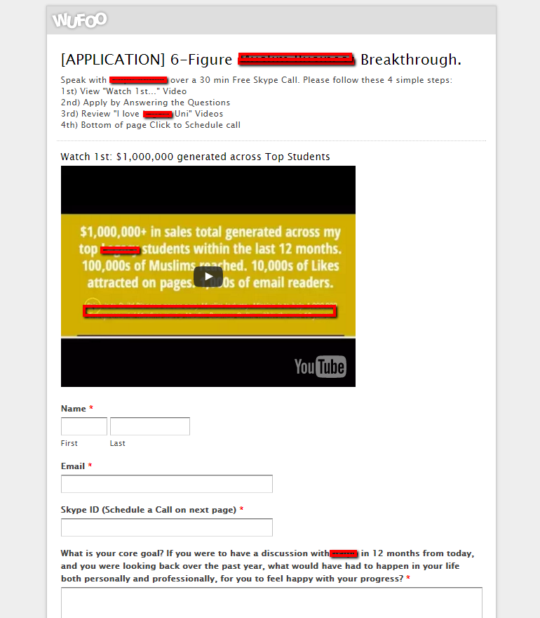
Here’s a landing page put together by a business owner who is targeting the Muslim entrepreneurs. We’re in a secret Facebook marketing group where he posted the link for review. The offer is a 30-minute skype consultation.
The Unique Selling Proposition is that the guy is sort of a celebrity in the young Muslim Entrepreneurs world so anyone who’s tried to do some online work has heard of the guy. The goal, of course, is for Muslim visitors that land on the landing page to fill up the form with as many details as possible and schedule a consult. So there is a clearly defined audience and offer. There’s a clearly defined USP and clearly defined goal. All good!
Clarity is great… but what good is clarity if nobody is willing to listen?


Below Is My Response/Review Of This Page
If the Muslim population is your target you need a graphically adorned form that will speak reliability to your audience. I’m no expert on designing stuff for Muslim audience but I did work with a graphics designer who’s doing work in Dubai at the moment. So based on the style I’ve seen I’m building my ideas of what a “Muslim” design should look like:
- Increase the width of the form to 1200px instead of the current 650px. This will create a wide enough space for a graphically rich header with either some tiled pattern or some calligraphy-style design. And put a photo of you up there. YOU are the product here.
- Take a larger resolution of the Youtube video, center it and put it on a background.. maybe a rich shade of green. I personally love the “British racing green” and it would be a trusted color for Muslims (referring back to some World Religions classes I took the word was that Green is a standard color for the Koran, so this should speak value to the subconscious mind)
- Have the labels be Your Name, Your Email, Your Skype ID. The “your” makes it more conversational and personal…. and therefore less generic.
- Change the font. Use Arial or Calibri or alike. Something a bit larger and thinner. Bulky letters convey a visual message of undefinedness. See how Facebook uses a thin 1:1.6 font ratio. It’s like this for a reason.
- Switch the language in the questions to be conversational. Make it sound as if you’re asking the questions instead of using a third-person approach.
- All the testimonial videos, either make them larger and centered with clear Titles or have them zig-zag and add a short quote, a punchline from each video. Have 2/3 of the width covered with the video and 1/3 with the punchline/quote.
- The CTA button needs styling. Also, drop the Caps.
- Add an FAQ section
- Add trust enhancers, some sort of warranties etc.
- Put the form onto your own website. There are tons of contact form builders that can be used to build this questionnaire. Contact Form 7 is free and you get full flexibility in designing the page, pixeling it any way you want, and even do a Heatmap tracking on it to see how people interact with it. And you can also do split tests.
Hope this helps man, feel free to ask for extra info if you need more help. Godspeed.
Landing Page Optimization Points To Consider
There are tons of materials on the web for landing page optimization procedures and techniques. Some rely on Heatmap tracking, some rely on split-testing. But before you even get to track visitors and test conversions, the initial landing page optimization technique is cognitive psychology. You start with a simple question: what motivates people to read, and how do I communicate that motivator.
With Landing Pages, you want to have a clear message and a clear Call to Action (CTA). The page of my friend here does have clarity. But it lacks some punch.
Here’s what I mean by “lack of punch”: Each page has less than a second to get a WOW effect on a subconscious level. In that split-second, if the page doesn’t compel the visitor to take the extra step and dedicate another 2-3 second to scan the page, this visitor will bounce. That’s one lost conversion, and potentially a lost client.
To achieve extra punch the landing page needs a clear textual and graphical communication style that appeals to the target audience. A good landing page will use text and images in such a way that they will both be able to tell the story in and of themselves, but put together and arranged properly the text and graphics create a massive punch that will get visitors to stop and listen to what you want to say.
So when you create your landing page or you run a landing page optimization review, make sure you tick the following boxes:
- Get a very clear, value-based header space. This can be a graphics-only, or text only or a mixed pack. If it’s a product you sell, make sure there’s a good photo of the product. If it is services you sell (where the product is YOU), make sure you have a good mugshot.
- Be smart in using color/shape/size contrasts. In newspapers, headlines are huge compared to the text itself, and the subhead size-wise is somewhere in-between. This is so for a reason. Large font size plays the Size game. Our brain fixates on what stands out. The big text stands out. Big graphics too. Strong colors stand out even more. Ever notice how the Buy Button always (hopefully) is a big bright button?
- Be personal with your text. Nobody wants to read a generic text. You want your text to be conversational. So when you write the copy, read it aloud, first in front of a mirror, and then to a friend. If you feel awkward reading the text to your friend how do you expect strangers to react to your copy?
- Use contrasting/zig-zagged layout of the page. Our minds are so inundated with media and graphics that we can tell the difference between a boring and an engaging design on a subconscious level. Research shows that combining images and texts that complement each other’s message work very well. Zig-zagged arrangement of images and text blocks work even better as it breaks up the visual “weight” of the text.
There are tons of other little things to consider, and I’m in no way attempting to create an exhaustive list here. The ones I’ve listed are absolute must-do points, though. Paying attention to detail is what will set your landing page apart from all the other generic landing pages. In a world where we’re getting bombarded with all sorts of offers, deals, super-deals, and whatnots, you simply can’t afford to be generic to your specific audience.
Need help with your landing page optimization?