Heatmaps, scroll reach and eye-tracking analysis tools help marketing professionals see how visitors interact with landing pages and product pages.
Although landing pages are built to speak with the given Brand Personality and address any questions/issues/worries that the Ideal Client Persona would have, many times these preconceptions are misplaced and the landing page fails to make the best of all the visitors it gets. With each product page, designers and copywriters need to answer several questions:
- Who is the ideal client,
- How they consume content online and
- What are the motivational factors
Based on these questions, copywriters and designers will decide on a landing page:
- Short copy vs long copy
- Graphics-heavy or minimalistic
- Strong sales vs soft sales pitch
Ideal Persona Description
Here is a case study of a heatmap and scroll reach analysis of a product page for a laptop repair manual. In a nutshell, the Ideal Client Persona was set to be:
- Early 20es, student age
- Willing to research and read
- Ready to experiment, a DIY person
- Has emotional attachment to their laptop
- Not willing to invest money in a new laptop
This page was built several years ago and up until recently the Conversion Rate was hovering around 2%. However, this rate dropped significantly and is now close to 0.5% which warranted a heatmap analysis to see how visitors engage with the content and to select elements for A-B split testing. The traffic hasn’t dropped, which can be interpreted that there is still interest for this repair manual, but something has changed in the Ideal Persona’s way of interacting with the page.
This is a long-copy landing page (assumption: visitors are OK researching and won’t have a problem reading through this long copy). So the very first question we tried answering was
Is long-copy product page engaging enough for readers to go through the entire page and get sold in the idea of buying this manual?
Does Long Copy Work: Scroll Reach Analysis
Here’s a scroll-reach map showing how far visitors scrolled on the page:
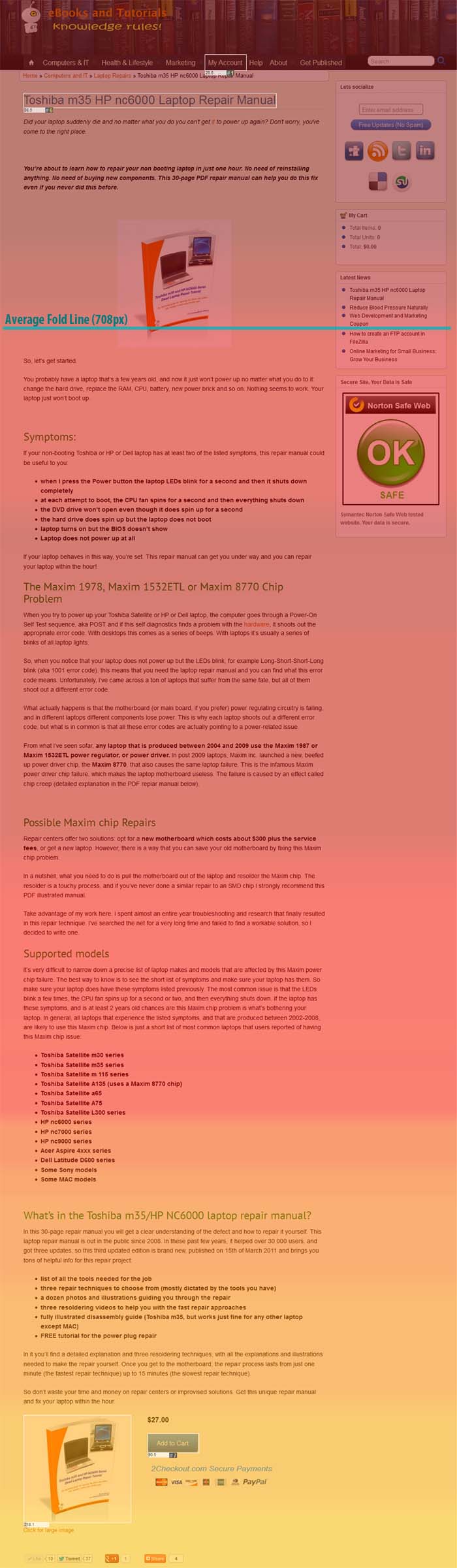
The scroll reach is color-coded, where red shades represent more attention (more time spent on page section) and yellow, blue and green shades represent lower areas of interest. The median fold line was set on 708 px, which points to a 15-inch monitor. The interesting find here is that people spent very little time above the fold, which goes against most of the preconceptions that everything above the fold gets extra attention.
The logic of this lack of interest above the fold is that we are no longer living in the Newspaper era and people are not afraid to scroll down to places that capture their attention. Another interesting point to make is that images aren’t always such an attention-grabber, nor are big chunks of bolded text. In fact, the bolded paragraph and product image got the least attention from the entire product page. Visitors spent only 1 second in the above-the-fold area. Even the comments got more attention than this prime area.
Although the preconception was that the Ideal Client will love to learn, the rather theoretical section of WHY this laptop failure happens got very little attention. At least it was less than expected.
Unsurprisingly, the Supported Models section got significant attention (people spent 25 seconds on average in this section). What is surprising though is that there is very distinct attention dedicated to the first seven bullets. After the seventh bullet, there is a significant drop in attention even though there are laptop models listed that are mentioned in the Title of the page.
Mouse-Hover Attention Map
Another very important analysis is attention mapping. As standard eye-tracking is out of the question (it is extremely expensive), we used mouse-hover heat mapping. The assumption is that people use the mouse cursor while reading through web pages. The limitation here is that many visitors will only scroll through the page without ever moving the mouse cursor, which is visible on the image below as several vertical hotspots of attention.
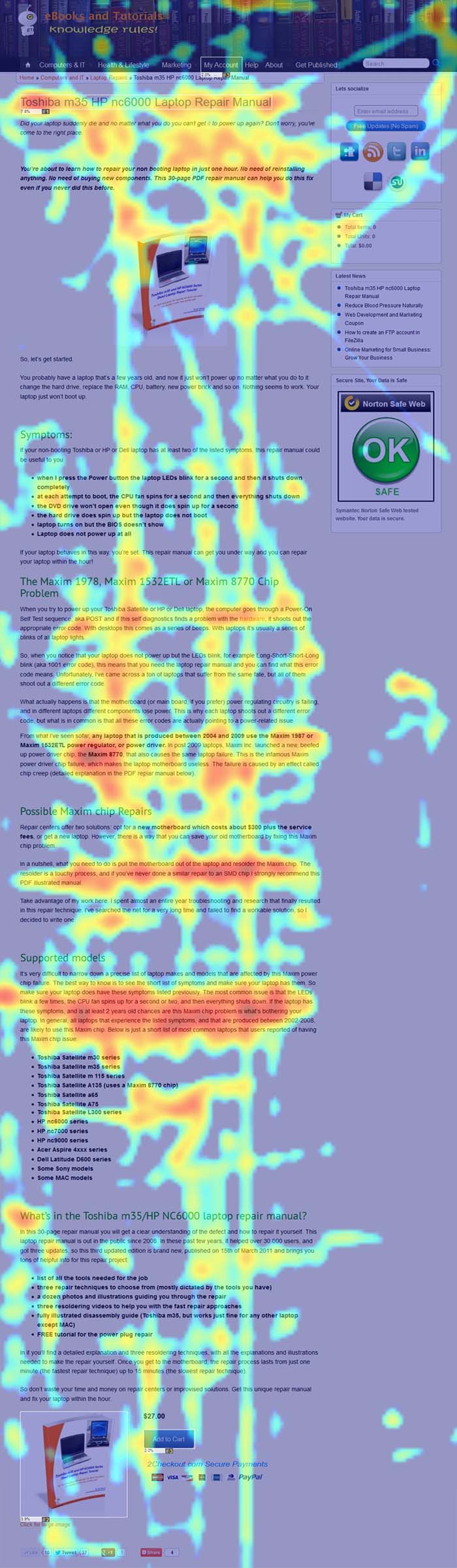
So, what’s on this heatmap?
First, it is clear that a busy header is a deterrent. In this case, the book-shelf type of header design acted as attention competitor and there are even some clicks on IT-related books. This means that header clutter with competitive elements can lead people to think that there are clickable areas on the header. As “blind clicks” are actions without result, this may create some anxiety/frustration, which is a negative element in the conversion efforts of this product page.
The second conclusion is that brand-keywords attract plenty of attention. There are several instances where Toshiba and Maxim are mentioned, which are brands and it seems that peoples’ attention is drawn toward these brand-names. This is really not a big surprise since the idea was that the Ideal Client has some emotional attachment to their laptop, and therefore the brand.
The third conclusion is that the Supported Models section gets the most attention, and the attention winner is a paragraph explains the symptoms of the broken laptop rather than a listing of models. What is interesting is that these symptoms were listed as bullet points previously, but the list got very little attention while the same text in paragraph form took the gold in terms of reader attention.
The fourth conclusion based only on this heatmap was that images and social buttons next to the CTA act as click competition. In fact, there were more registered clicks on the product image and sharebar. This was a surprise as we expected that the product image will act as an attention anchor that will lead people to the Buy Now button.
However, when we took into consideration the time of each click, it turned out that all clicks on the Add to Cart button were done in the first 90 seconds even though the average time spent on the page was 228 seconds. In fact, the clicks on the product image and social buttons were done well after visitors went through the comments.
Attention/Heatmap Analysis Conclusions
- People are not afraid of long pages and scroll through the entire page
- Images and bold blocks of text aren’t always attention grabbers
- Bullet lists should never be longer than 7 items
- Busy headers should be avoided for product pages (headerless design of product pages may work better)
- Brand names are attention grabbers, use them within the CTA
- Bullet lists may not work better than paragraphs, people sometimes prefer conversational vs. preachy writing
- Purchases happen in the first 90 seconds, without reading through the entire copy nor viewing any social proof
All this points to a very different Ideal Persona character map:
- Pragmatic: people that buy now are a lot more pragmatic than previously. They don’t want to know WHY their laptop broke, but HOW they can fix it.
- Critical: people don’t care about sales bullet points and prefer correct subtitles with conversational explanations of the situation
- Shop-Savy: Long bullet lists don’t work. Stick to 7-item bullets or you’ll be seen as pushing it and turn out being boring
- Impulsive: People are less likely to spend time reading and are prone to make impulsive purchasing decisions
- Doubtful: Social proof doesn’t always result in more sales
All in all, over the past 3 years, it seems the college generation shifted from inquisitive and trusting toward impulsive and doubtful. Regardless of the social implication of this kind of behavioral shift, this study points that as the customer base changes, so should product pages. The bottom line is that when clients change, the sales copy must follow.